
When designing title cards and graphics, focus on setting the tone and engaging your audience instantly. Choose typography that reflects the mood, using bold fonts for strength or handwritten styles for intimacy. Use color schemes wisely, evoking emotions and ensuring contrast for readability. Keep your design cohesive and simple, guiding viewers’ attention effectively while supporting your storytelling. Mastering these principles will help you create impactful visuals that leave a lasting impression—continue exploring to unleash even more creative strategies.
Key Takeaways
- Choose fonts that reflect the tone and emotion of the content, balancing readability with style.
- Use color schemes that evoke appropriate feelings and enhance the mood of the title card.
- Incorporate visual contrast and consistency to ensure key information stands out and maintains cohesion.
- Apply design principles like simplicity and visual hierarchy to guide viewers’ attention effectively.
- Align graphic elements with the narrative style to create a memorable and immersive first impression.

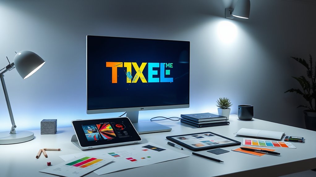
Have you ever noticed how title cards and graphics set the tone for a film or TV show? It’s no accident. The moment you see the opening credits or scene introductions, your mind begins to interpret the mood and style of what’s to come. This is where your choices in typography and color schemes become powerful tools. When you select typography choices, you’re not just picking a font; you’re shaping the viewer’s emotional response. For example, a bold, blocky font can communicate strength or seriousness, while a handwritten style might evoke intimacy or quirkiness. Your font selection should reflect the story’s mood and help establish a visual identity that complements the narrative. Be mindful of readability, but don’t shy away from experimenting with custom or stylized fonts that reinforce the tone. Pairing typography with color schemes further enhances this effect. Color schemes evoke feelings; cool tones like blues and greens can suggest calmness or mystery, while warmer hues like reds and oranges evoke energy or urgency. When designing a title card, think about how these colors interact with your typography. For instance, a bright yellow font on a dark background grabs attention instantly and can convey optimism or excitement. Conversely, muted colors might suggest subtlety or seriousness. The key is to create contrast that makes your text stand out without overwhelming the viewer. Consistency in your color schemes across title cards and graphics helps establish a cohesive visual language. If your film has a noir aesthetic, sticking with dark backgrounds and desaturated tones will reinforce that style. If it’s a vibrant comedy, lively colors paired with playful fonts will set the right mood. Remember, every element should support the story you’re telling. Don’t just choose fonts and colors arbitrarily—consider their psychological impact and how they interact with each other. Your goal is to communicate tone instantly, making a memorable impression from the first frame. Keep in mind that simplicity often works best. Overly complicated fonts or chaotic color schemes can distract or confuse the audience. Instead, aim for a balanced, intentional design that highlights key information and complements the overall visual narrative. Incorporating visual hierarchy principles can help guide the viewer’s eye effectively. Ultimately, your skill in selecting typography choices and color schemes will determine how effectively your title cards and graphics engage viewers and reinforce the story’s tone. When done right, they don’t just introduce a show or film—they immerse viewers in its world right from the start.
title card font packs
As an affiliate, we earn on qualifying purchases.
As an affiliate, we earn on qualifying purchases.
Frequently Asked Questions
What Are the Latest Trends in Title Card Design?
You’ll notice that the latest trends in title card design emphasize animated typography and minimalist aesthetics. You can create engaging titles by using dynamic, moving text that captures attention without clutter. Minimalist designs with clean lines, simple color palettes, and subtle animations are popular, helping your content look modern and professional. Incorporate these trends to make your title cards stand out, ensuring they complement your overall visual style effectively.
How Can I Optimize Graphics for Mobile Viewing?
Imagine your graphics as a lighthouse guiding viewers through a stormy sea. To optimize for mobile viewing, you should prioritize mobile responsiveness, ensuring your design adapts seamlessly to different screens. Use image compression to reduce load times without sacrificing quality, making sure your graphics stay sharp and quick to load. Keep it simple and clear, so your message shines brightly, no matter the device your audience uses.
What Software Is Best for Quick Title Creation?
You should try Canva or Adobe Spark for quick title creation. They offer user-friendly interfaces and plenty of templates, helping you choose typography and color schemes easily. With these tools, you can customize fonts, adjust colors, and add graphics swiftly, ensuring your titles look professional without spending too much time. Both platforms are perfect for fast, high-quality results, whether you’re creating social media titles or video overlays.
How Do I Ensure Accessibility in Graphic Design?
Imagine your graphics as inviting doorways; you want everyone to enter comfortably. To guarantee accessibility, focus on color contrast so text stands out clearly against backgrounds, and choose font readability that’s easy on the eyes. Use bold, simple typefaces and avoid cluttered designs. Test your graphics with tools like screen readers to catch issues early, making your visuals inclusive and welcoming for all viewers.
What Are Common Mistakes to Avoid in Title Card Creation?
You should avoid typography pitfalls like choosing fonts that are hard to read or too decorative, which can distract viewers. Also, steer clear of color mismatches that reduce contrast and make text difficult to see. Keep your design simple, legible, and consistent. Use contrasting colors thoughtfully, and test your title card on different screens. These tips help maintain clarity and engagement, ensuring your message comes across effectively.
graphic design color schemes
As an affiliate, we earn on qualifying purchases.
As an affiliate, we earn on qualifying purchases.
Conclusion
Remember, well-designed title cards and graphics grab attention and set the tone for your content. Did you know viewers spend 84% more time watching videos with engaging visuals? By choosing bold fonts, vibrant colors, and clear layouts, you can make your message stand out. Keep experimenting and refining your designs to connect more effectively with your audience. With the right visuals, you’ll turn viewers into loyal fans who enthusiastically await your next project.
custom stylized fonts for titles
As an affiliate, we earn on qualifying purchases.
As an affiliate, we earn on qualifying purchases.
visual hierarchy design tools
As an affiliate, we earn on qualifying purchases.
As an affiliate, we earn on qualifying purchases.