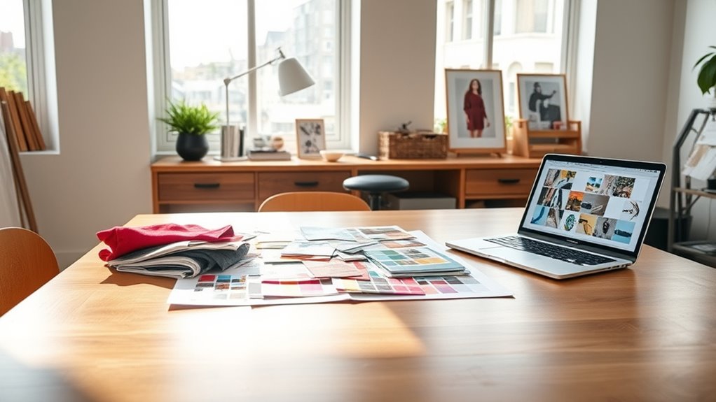

To create mood boards for visual consistency, start by gathering images, textures, and colors that reflect your project’s core themes and emotional tone. Focus on selecting a cohesive color palette, limiting to a few complementary shades, and choosing typography that matches the vibe. Guarantee that imagery, colors, and fonts work harmoniously, creating a unified visual language. Keep this mood board dynamic and update it as your project develops—discover how to refine your approach as you continue.
Key Takeaways
- Collect images, textures, and colors that reflect the desired emotional tone and core themes for visual cohesion.
- Choose a consistent color palette with primary and accent colors to unify all design elements.
- Select typography that aligns with the mood, limiting fonts to maintain clarity and avoid visual clutter.
- Ensure imagery style complements chosen fonts and overall color scheme for harmonious visual language.
- Regularly review and update the mood board to maintain consistency throughout the design process.
Have you ever struggled to maintain a cohesive look across your design projects? If so, creating a mood board can be a game-changer. It acts as a visual blueprint, helping you align your ideas and guarantee consistency throughout your work. To start, focus on assembling a collection of images, textures, and colors that evoke the vibe you want to communicate. This collection should reflect your project’s core themes and emotional tone, giving you a clear direction from the outset.
Creating a mood board helps align ideas and ensure consistency across your design projects.
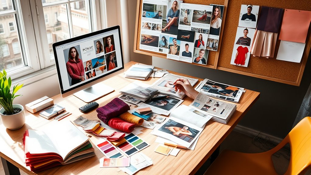
When building your mood board, pay close attention to your chosen color palettes. Colors evoke feelings and set the mood, so selecting the right combination is vital for visual harmony. Stick to a primary color scheme, then add complementary or accent colors to create depth. This careful curation helps prevent your project from feeling disjointed and guarantees every element supports your overarching concept. A well-defined color palette also simplifies decisions later on, providing a consistent reference for backgrounds, icons, and other design elements.
Typography choices play a vital role in reinforcing your mood and maintaining consistency. Your font selections should align with the overall tone—whether it’s playful, professional, modern, or vintage. Limit yourself to a few typefaces to avoid visual clutter and maintain clarity. When adding typography to your mood board, include examples of how you plan to use these fonts in headings, body text, and accents. This visual representation helps you see how typography interacts with other elements, making it easier to refine your choices before applying them to your actual project. Additionally, understanding visual hierarchy can guide your font sizes and styles to create an effective flow of information.
As you gather images and elements for your mood board, think about how your color palettes and typography choices work together. Do the colors complement the fonts? Does the style of imagery match the typographic mood? Strive for harmony among all components. This process not only guides your design decisions but also provides a unified visual language that can be easily communicated to clients or team members. When everyone is on the same page, maintaining consistency becomes much simpler.
Finally, a mood board isn’t a static tool—it should evolve as your project develops. Revisit and refine it regularly, adding new inspirations or adjusting elements that don’t quite fit. By keeping it current, you create a reliable visual reference that keeps your project cohesive from start to finish. When you master the art of creating a mood board with thoughtful color palettes and typography choices, you’ll find it much easier to craft designs that are both visually appealing and harmoniously consistent.
Frequently Asked Questions
How Do I Choose the Right Color Palette for My Mood Board?
To choose the right color palette, start with color theory to understand complementary and harmonious colors. Use color psychology to pick hues that evoke the desired mood or emotion. Consider your project’s theme and target audience, then select colors that support your message. Experiment with shades and tones, and trust your instincts. Keep it balanced and cohesive to make certain your mood board effectively communicates your vision.
What Tools Are Best for Creating Digital Mood Boards?
Think of digital tools as your creative palette. You’ll love apps like Canva and Adobe Spark, which offer easy-to-use mood board templates. These platforms let you craft vibrant digital collages effortlessly, helping you visualize your ideas clearly. Use their built-in features to drag and drop images, add colors, and organize your mood board seamlessly. They’re perfect for bringing your concepts to life with professional polish and flexibility.
How Can I Ensure My Mood Board Aligns With My Brand Identity?
To guarantee your mood board aligns with your brand identity, focus on maintaining brand consistency by incorporating your brand’s colors, fonts, and imagery. Use visual storytelling to convey your brand’s message clearly and authentically. Regularly compare your mood board against your existing brand assets, and seek feedback to refine your visuals. This keeps your mood board cohesive, impactful, and true to your brand’s core values.
What Are Common Mistakes to Avoid When Designing a Mood Board?
You should avoid cluttered layouts that make your mood board confusing and hard to interpret. Inconsistent imagery can also weaken your message, so choose visuals that complement each other and align with your brand. Don’t overcrowd the board or use too many styles, as this can dilute your vision. Keep it simple, focused, and cohesive to effectively communicate your brand’s personality.
How Often Should I Update or Revise My Mood Board?
You should update your mood board whenever seasonal updates or project revisions occur. Regularly revising it helps keep your visuals aligned with current trends and project goals. Don’t wait too long; frequent updates ensure your mood board stays relevant and inspiring. Typically, review it every few months or when major changes happen. This way, your visual strategy remains fresh, cohesive, and effective throughout your project.
Conclusion
Now that you know how to create mood boards, you’re like a captain steering your visual ship through a sea of ideas. They’ll keep your design journey on course, ensuring every element works harmoniously. Think of your mood board as a magnetic north, guiding your creative direction with clarity and purpose. With this tool in hand, you’ll turn scattered inspirations into a cohesive masterpiece, making your visual story impossible to ignore.