
To craft title sequences that tell a story, focus on combining compelling visuals, typography, and motion to set the tone and hint at themes. Choose fonts and colors that evoke the right emotions, and use animation to create rhythm and tension. Integrate imagery or motifs that support the narrative or atmosphere. Every element should serve a purpose, seamlessly connecting to the overall look. Keep exploring these techniques to design sequences that truly engage and intrigue your audience.
Key Takeaways
- Use thematic imagery, textures, and motifs to visually hint at the story’s core themes and setting.
- Align typography style, color, and animation with the mood and tone of the narrative.
- Incorporate visual and textual elements that foreshadow plot points or character traits.
- Maintain a cohesive visual language by thoughtfully integrating movement, color, and typography.
- Balance pacing and animation techniques to evoke desired emotions and build anticipation.
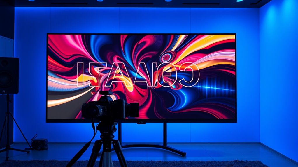
Title sequences set the tone for a film or TV show, immersing viewers right from the start. They’re more than just a list of credits; they’re an opportunity to create a visual storytelling experience that hints at the story’s mood, themes, and style. When you craft a compelling title sequence, you’re guiding your audience into the world you’ve built, inviting them to feel connected before the narrative even begins. The key to achieving this lies in thoughtful typography design and visual storytelling that work hand-in-hand.
Typography design isn’t just about choosing a pretty font; it’s about selecting and manipulating type to evoke emotion, reflect the series’ tone, and enhance the overall aesthetic. You can use bold, angular typefaces to suggest strength or danger, or delicate, flowing scripts to evoke elegance or mystery. The way you animate, position, and layer your typography can dramatically influence how viewers interpret the sequence. For example, jagged, disjointed text might communicate chaos, while smooth, flowing lines suggest calm and sophistication. The size, color, and movement of the type play vital roles in shaping the audience’s emotional response. Incorporating typography animation techniques can further elevate the visual impact and storytelling potential of your sequence. Additionally, understanding color theory can help you select hues that evoke specific feelings or complement your overall design.
Thoughtful typography evokes emotion, sets tone, and enhances aesthetic through animation, positioning, and layering choices.
Visual storytelling within title sequences involves more than just type. It’s about creating a visual narrative that complements the story’s core themes. You might incorporate imagery, textures, or motifs that hint at the plot or setting. Think about how visual elements interact with your typography—do they reinforce each other or create contrast? For instance, a gritty, textured background paired with sleek, modern type can set a tone of gritty realism juxtaposed with futuristic elements. You’re intentionally designing these elements to evoke curiosity and anticipation, subtly hinting at what’s to come. Incorporating artistic expression into your sequences can further deepen the viewer’s connection and engagement.
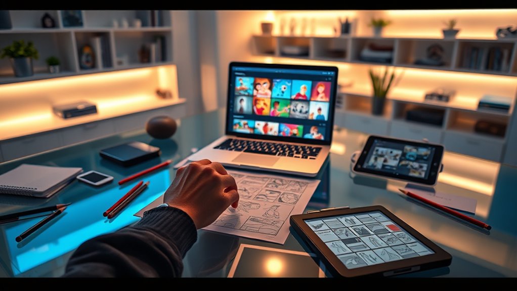
Additionally, understanding the resources and tools available can help you craft more effective sequences, whether through specialized animation software or curated visual assets. Your goal is to craft a sequence that’s memorable and meaningful. Every movement, every color choice, and every typographic detail should serve a purpose—whether it’s to establish mood, hint at character traits, or foreshadow plot points. Use pacing wisely; a slow reveal of text can build anticipation, while quick cuts can generate excitement or tension. Keep in mind that the sequence should seamlessly connect with the overall visual language of the show or film. When you master the art of visual storytelling through typography design, you create a title sequence that not only introduces the work but also enriches the viewer’s experience, making a lasting impression right from the opening moments.
title sequence animation software
As an affiliate, we earn on qualifying purchases.
As an affiliate, we earn on qualifying purchases.
Frequently Asked Questions
How Do Cultural Differences Influence Title Sequence Storytelling?
Cultural differences greatly influence how you interpret title sequence storytelling. You notice how cultural symbolism shapes the visuals and themes, making them resonate differently across audiences. Storytelling conventions also vary, guiding how information is presented and understood. By understanding these cultural nuances, you can craft title sequences that effectively communicate the story’s essence, respecting diverse perspectives and enhancing viewer engagement through culturally sensitive storytelling techniques.
What Are Common Mistakes to Avoid in Narrative Title Sequences?
When creating narrative title sequences, you should avoid visual clutter that distracts viewers from the story and inconsistent pacing that disrupts engagement. Keep your visuals clear and focused, ensuring they complement the narrative rather than overwhelm it. Also, plan your pacing carefully so the sequence flows smoothly, building anticipation without feeling rushed or dragging. These mistakes can dilute your message and reduce the impact of your opening.
How Can Animation Enhance Storytelling in Title Sequences?
Animation can remarkably enhance storytelling in title sequences by using visual symbolism to convey themes and mood instantly. You can also highlight character development by showcasing key traits or transformations through dynamic movements and design. Active animation draws viewers in, making the story feel more immersive from the start. When you thoughtfully incorporate these elements, your title sequence not only introduces your film but also sets a compelling tone and narrative foundation.
What Is the Ideal Length for a Compelling Title Sequence?
You should aim for a title sequence that’s around 10 to 15 seconds long to keep viewers engaged. Focus on typography choices that are clear and impactful, and select color schemes that set the tone. Keep it concise, ensuring each element contributes to storytelling without overwhelming. An ideal length balances visual interest with narrative clarity, making your sequence memorable without dragging on.
How Do Budget Constraints Impact Creative Choices in Title Design?
Budget constraints are like tight ropes, guiding your creative choices in title design. You have to prioritize resource allocation carefully, often sacrificing elaborate effects for simplicity. Limited funds mean you might opt for minimalistic visuals or cheaper materials, but that can still convey a strong message. By focusing on core elements and clever design, you can craft impactful titles without overspending, turning resource limitations into creative opportunities.
typography animation tools
As an affiliate, we earn on qualifying purchases.
As an affiliate, we earn on qualifying purchases.
Conclusion
Now that you know the secrets to crafting compelling title sequences, you hold the power to transform any film into an unforgettable experience. Your sequences can set the entire tone, evoke emotion, and even steal the spotlight from the main story—like a magician revealing their greatest trick. So go ahead, release your creativity and make titles so enchanting that audiences won’t just watch—they’ll remember them for a lifetime. Your storytelling magic starts now!
visual storytelling assets for videos
As an affiliate, we earn on qualifying purchases.
As an affiliate, we earn on qualifying purchases.
motion graphics templates for titles
As an affiliate, we earn on qualifying purchases.
As an affiliate, we earn on qualifying purchases.