
To match a franchise’s aesthetic with color grading, start by analyzing its signature palette and use color wheels to set the mood. Apply consistent LUTs for uniformity, then fine-tune hue, saturation, and luminance for cohesion. Incorporate film emulation and grain to add authenticity, balance exposure and contrast, and use masking or secondary corrections for precision. Mastering these tricks helps you replicate the look—keep going to discover even more expert techniques.
Key Takeaways
- Analyze the franchise’s signature color palette and incorporate primary, secondary, and key hues for visual consistency.
- Use film emulation techniques and film stock matching to replicate authentic textures and mood.
- Apply color grading LUTs as a base, then fine-tune hue, saturation, and curves for cohesive aesthetics.
- Utilize color wheels and schemes (complementary, analogous, triadic) to evoke specific emotions and tone.
- Balance exposure, contrast, and add grain or texture to mimic traditional film for authentic franchise look.
professional color grading LUTs
As an affiliate, we earn on qualifying purchases.
As an affiliate, we earn on qualifying purchases.
Analyzing the Franchise’s Signature Color Palette

Understanding a franchise’s signature color palette is essential for creating visually cohesive and memorable content. You need to analyze how each color influences perception through color psychology, ensuring they evoke the right emotions and associations. You can also consider how color differentiation helps distinguish different aspects of the franchise’s visual identity. Pay close attention to the primary and secondary colors used across branding materials, as these establish branding consistency. Recognize patterns and key hues that define the franchise’s identity, and note how they work together to reinforce the brand message. When you understand the core palette, you can adapt your color grading to enhance the franchise’s aesthetic without diluting its recognizable look. Additionally, understanding color associations and how they impact viewer perception allows for more strategic visual branding. Being aware of visual identity elements such as logos, typography, and imagery can further strengthen your cohesive approach. This foundation helps you create visuals that resonate with audiences and maintain a unified brand image across all media. Moreover, integrating brand personality into your color choices can deepen the emotional connection with viewers and support overall branding objectives. Recognizing how aesthetic choices influence viewer engagement ensures your content aligns with the franchise’s overall branding strategy.
film emulation film stock filters
As an affiliate, we earn on qualifying purchases.
As an affiliate, we earn on qualifying purchases.
Using Color Wheels to Match Tone and Mood
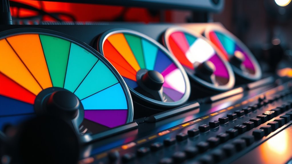
Color wheels are powerful tools that help you visualize and manipulate hues to match the desired tone and mood of your project. Using color wheel theory, you can identify complementary, analogous, or triadic color schemes to enhance emotional impact. To refine your adjustments, apply tone adjustment techniques like shifting shadows or highlights, enhancing specific color ranges. Additionally, understanding biodiversity protection can inform more nuanced color choices that evoke specific emotional responses. For example, incorporating natural color palettes inspired by diverse ecosystems can deepen the authenticity of your visual storytelling. Incorporating elements from farmhouse bedroom design principles, such as warm tones and rustic textures, can also influence the overall mood of your visuals. Understanding how cultural celebrations influence color symbolism can also help create more authentic and resonant visuals. Here’s a quick guide:
| Color Scheme | Mood Effect | Example Use |
|---|---|---|
| Complementary | Creates contrast and tension | Highlighting conflict scenes |
| Analogous | Evokes harmony and calm | Building a warm, inviting feel |
| Triadic | Adds vibrancy and energy | Dynamic action sequences |
| Monochromatic | Establishes simplicity | Focusing on a specific emotion |
Mastering these techniques guarantees your color grading aligns seamlessly with the franchise’s signature aesthetic.
color wheels for video editing
As an affiliate, we earn on qualifying purchases.
As an affiliate, we earn on qualifying purchases.
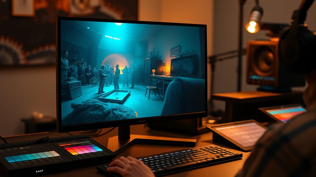
Applying Color Grading LUTs for Consistency
Applying color grading LUTs is essential for maintaining visual consistency across your project, especially when working on multiple scenes or shots. Many believe that LUTs are a quick fix or that they eliminate the need for further adjustments, which is a common color grading myth. Instead, think of LUTs as a starting point that streamlines your workflow optimization. They help you quickly match tones and styles across different shots, saving time and ensuring a cohesive look. However, relying solely on LUTs can lead to flat or unnatural results if not properly fine-tuned. Use them as a foundation, then refine your grading with targeted adjustments afterward. This approach keeps your process efficient while ensuring your project aligns with your franchise’s aesthetic standards.
video color correction tools
As an affiliate, we earn on qualifying purchases.
As an affiliate, we earn on qualifying purchases.
Adjusting Hue, Saturation, and Luminosity for Cohesion

Once you’ve applied your LUTs to establish a baseline, fine-tuning hue, saturation, and luminosity becomes key to achieving visual cohesion. Adjusting hue ensures color harmony across your footage, aligning tones to match the franchise’s signature look. Modifying saturation helps balance vividness, preventing colors from overpowering or fading into the background, which supports strong visual storytelling. Luminosity control fine-tunes brightness levels, maintaining consistent exposure and depth throughout scenes. These adjustments help unify different shots, creating a seamless aesthetic that reinforces the franchise’s identity. Additionally, understanding color grading techniques can further refine your aesthetic to match specific franchise themes. Incorporating color correction practices can also improve the overall quality and consistency of your footage, ensuring a polished final product.
Creating Custom Looks With Curves and Color Grading Panels

Creating custom looks with curves and color grading panels allows you to craft unique visual styles tailored to your project’s mood and narrative. By adjusting curves, you can fine-tune contrast and color balance, directly applying color theory principles to evoke specific emotions. Use the RGB curves to target shadows, midtones, and highlights, shaping the image’s overall tone. Color grading panels enable you to refine hues further, ensuring consistency with your franchise’s aesthetic. Proper camera calibration informs your adjustments, helping to match the original footage’s color space and exposure. Understanding contrast ratio also plays a vital role in how your images will appear, especially in scenes requiring deep blacks and bright whites. Additionally, paying attention to color grading workflows can streamline your process and improve results. Incorporating color management best practices ensures your colors stay consistent across different devices and platforms. This combination of tools empowers you to develop distinctive looks that resonate with your audience while maintaining technical accuracy. Mastering these techniques lets you push creative boundaries and achieve a polished, cohesive visual style. Additionally, understanding how color grading tools influence overall atmosphere can elevate your project’s visual storytelling.
Incorporating Film Emulation Techniques

To achieve a genuine film look, start by selecting the right film stock type to match your desired aesthetic. Then, add grain and texture layers to mimic the tactile quality of film, adjusting them to suit your scene. Finally, tweak your color curves to refine the overall tone and color balance, bringing authentic film characteristics into your footage. Incorporating film emulation techniques can further enhance the realism and depth of your color grading process. Understanding color science principles can help you make more informed adjustments that align with traditional film responses and Mazda Tuning, especially when aiming for a cohesive aesthetic style. Additionally, exploring personal development concepts like visualization can inspire creative approaches to your grading workflow.
Selecting Film Stock Types
Have you ever wondered how different film stocks influence the mood and texture of your footage? The choice affects how digital sensors capture color and contrast, shaping your final look. Film stocks vary in their color reproduction, saturation, and contrast levels, which can be emulated through color grading. When selecting film types, consider the color spaces they produce—some emphasize warm tones, while others highlight cooler hues. Digital sensors don’t inherently replicate these nuances, so matching your footage to a specific film stock involves adjusting hue, saturation, and contrast to emulate its unique characteristics. By understanding the qualities of different film stocks, you can better tailor your color grading process to match the aesthetic of your desired franchise or style. Additionally, exploring film emulation techniques can help you achieve authentic results that honor the original aesthetic. Recognizing the resources and tools available for film emulation can significantly enhance your grading workflow and authenticity. For example, employing dedicated film simulation plugins can streamline the process and ensure more accurate emulation.
Emulating Grain and Texture
Emulating grain and texture is essential for adding authenticity and mood to digital footage, especially when aiming for a filmic look. You can achieve this by incorporating subtle grain textures that mimic traditional film stock. Film emulation techniques often include overlaying or generating grain that matches the desired era or franchise aesthetic. Adjusting grain intensity helps you control how prominent the texture appears, ensuring it enhances rather than distracts. Texture adds depth, making your footage feel more organic and tactile. When applying film emulation, look for plugins or tools that offer realistic grain patterns and control options. This process bridges the gap between digital sharpness and the warm, imperfect qualities of film, giving your project a more authentic, cinematic feel.
Adjusting Color Curves
Adjusting color curves is a powerful way to replicate the tonal and color characteristics of different film stocks. By tweaking curves, you can enhance color contrast and refine shadow detail, giving your footage a specific filmic look. For example, increasing the red curve can evoke a warm, vintage feel, while lowering the blue enhances a cooler tone. Use the following table to visualize common curve adjustments:
| Effect | Curve Adjustment |
|---|---|
| Boost color contrast | S-shaped curve in RGB channels |
| Enhance shadow detail | Lift shadows in the luminance curve |
| Emulate film stock | Fine-tune individual color channels |
This method helps you control tonal ranges precisely, making your footage match the aesthetic of iconic franchises.
Balancing Exposure and Contrast for Visual Uniformity

Balancing exposure and contrast is essential to achieve a cohesive and visually appealing image. Properly adjusting lighting contrast guarantees your highlights aren’t blown out, while shadow detail remains visible, creating depth and realism. When you fine-tune these elements, your footage aligns better with franchise aesthetics, offering uniformity across scenes. Focus on maintaining consistent exposure levels to prevent flickering or mismatched brightness. Use contrast controls to enhance the separation between light and dark areas without sacrificing shadow detail. This balance helps your images look polished and professional.
- Adjust exposure to prevent overexposure or underexposure
- Increase contrast for more visual punch without losing shadow detail
- Use scopes to monitor luminance levels accurately
- Maintain consistent lighting contrast across shots
- Avoid crushing blacks or blowing out highlights for natural depth
Utilizing Masking and Tracking for Precise Color Corrections
Masking and tracking techniques allow you to target specific areas of your footage for precise color corrections, guaranteeing consistency and control across complex scenes. By using masking techniques, you can isolate subjects, backgrounds, or objects, applying color adjustments without affecting the entire shot. Tracking accuracy is vital here; it ensures your masks follow moving elements seamlessly, maintaining perfect alignment throughout the scene. Accurate tracking minimizes the need for manual adjustments, saving you time and preventing distracting color shifts. With these tools, you gain fine control over specific regions, allowing you to match franchise aesthetics with precision. Mastering masking techniques and achieving high tracking accuracy empower you to create cohesive, polished looks that stay consistent from shot to shot.
Refining the Final Look With Secondary Color Grading
Refining the final look with secondary color grading allows you to fine-tune specific elements of your footage to achieve a polished, cohesive aesthetic. This step helps you enhance color harmony and deepen emotional impact by targeting particular colors or areas. You can isolate skin tones, backgrounds, or objects to adjust their hues, saturation, or luminance, creating a more intentional visual narrative. Secondary grading gives you control over subtle details that may disrupt your franchise’s signature style. By carefully refining these elements, you ensure consistency and emotional resonance across scenes.
- Isolate key colors for emphasis
- Adjust skin tones for natural or stylized looks
- Enhance background elements to set mood
- Balance highlights and shadows selectively
- Strengthen overall color harmony and storytelling
Frequently Asked Questions
How Do I Adapt Color Grading for Different Lighting Conditions Within the Franchise?
When adapting color grading for different lighting conditions, focus on maintaining lighting consistency across scenes. You should analyze each shot’s light temperature and intensity, then adjust your grade to match the overall aesthetic. Use scene adaptation techniques like balancing shadows and highlights, and applying LUTs or secondary color correction. This approach guarantees a seamless visual flow, keeping the franchise’s signature look intact despite varying lighting environments.
What Are Common Mistakes to Avoid When Matching Franchise Aesthetics?
Imagine painting a mural, but accidentally blending mismatched colors or over-saturating sections, ruining the scene’s harmony. When matching franchise aesthetics, avoid common mistakes like color mismatch and over-saturation. These errors can make your footage look inconsistent and jarring. Stay attentive to color tones, and keep saturation balanced. By doing so, you preserve the franchise’s visual identity, creating a seamless, immersive experience that feels authentic and polished.
How Can I Ensure Color Consistency Across Various Shooting Formats?
To guarantee color consistency across various shooting formats, you need to set your camera to a consistent color profile and stick with it. Regular calibration of your monitors to industry standards helps maintain accurate color representation. Always shoot in a flat or log format if possible, and apply consistent grading techniques. This approach minimizes discrepancies and keeps the look uniform across all footage, regardless of different formats or devices.
What Software Tools Are Best for Advanced Color Grading Techniques?
Ever notice how some films just look perfect? That’s often thanks to advanced color grading techniques. For this, you’ll want top-tier color grading software like DaVinci Resolve or Baselight. They support complex grading workflows, giving you precise control over color nuances. These tools help you achieve professional results and maintain consistency. With practice, you’ll gain the ability to craft stunning visuals that match your creative vision seamlessly.
How Do I Maintain Color Accuracy When Incorporating Visual Effects?
When incorporating visual effects, you need to maintain color accuracy by ensuring proper color calibration of your monitor and editing workspace. This keeps your color palette consistent and true to the original footage. Always check your project’s color settings after adding effects, and compare with reference images. Doing so helps you avoid color shifts, ensuring your visuals stay cohesive and match your intended aesthetic.
Conclusion
Remember, consistency is key when matching a franchise’s aesthetic. By analyzing the signature palette, using color wheels, and applying precise adjustments, you can create a cohesive look that feels authentic. Don’t forget to refine with masking and secondary grading for that polished finish. As the saying goes, “Practice makes perfect”—so keep experimenting and honing your skills to master these color grading tricks and bring your vision to life seamlessly.