
Using complementary color palettes can considerably influence the mood of your design. By pairing opposite colors like blue and orange, you create vibrant contrast that attracts attention while maintaining harmony. This balance allows you to evoke emotions such as energy, stability, or excitement effectively. Adjusting saturation and brightness helps fine-tune these effects, giving your work a polished, intentional feel. Continue exploring how mastering these combinations can elevate your visual impact even further.
Key Takeaways
- Complementary color palettes evoke strong emotional responses by creating vibrant contrast and visual energy.
- Pairing opposite colors on the wheel, like blue and orange, enhances mood through dynamic tension.
- Adjusting saturation and brightness in complementary schemes fine-tunes emotional impact and atmosphere.
- Warm and cool color combinations in complementary palettes can convey feelings of excitement, stability, or calm.
- Using neutral tones alongside complementary colors balances intensity, reinforcing the intended emotional message.
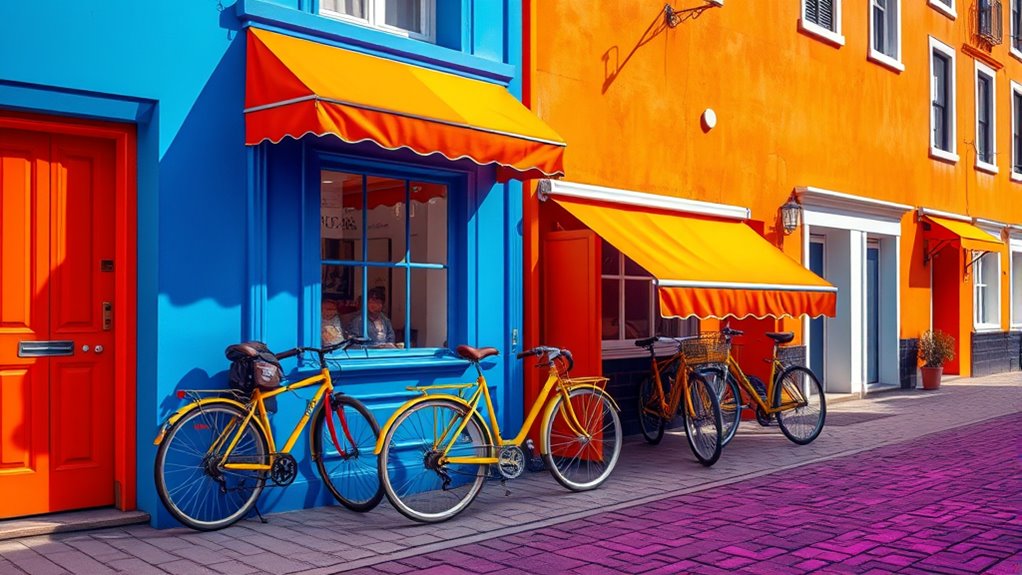
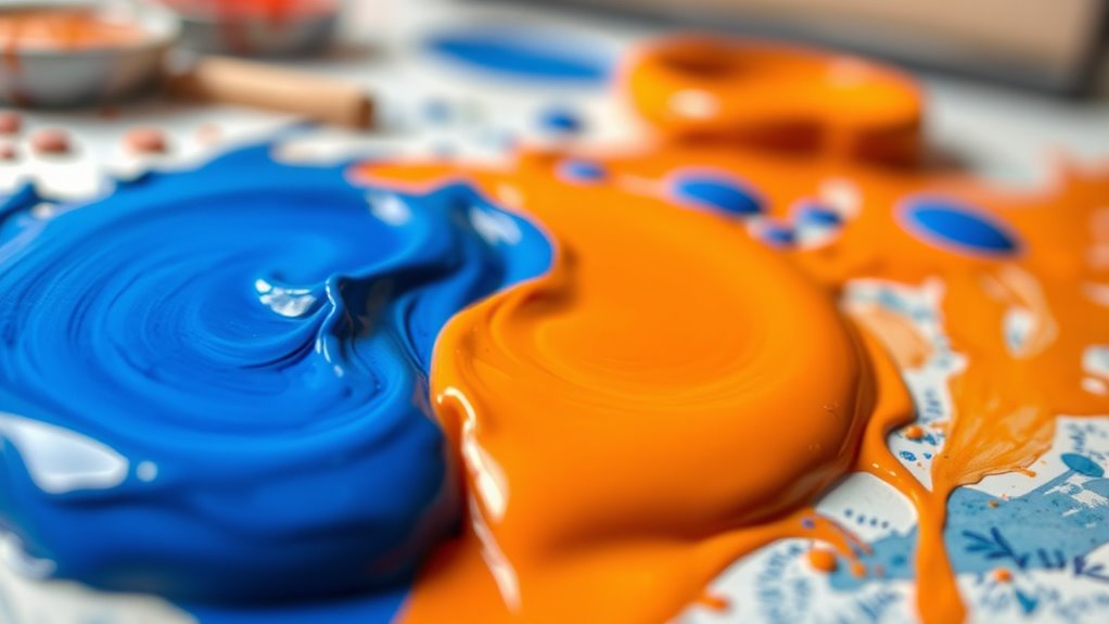
Color theory is the study of how colors interact and influence each other, providing a foundation for creating visually appealing and effective designs. When you understand the principles of color harmony, you can craft palettes that evoke specific emotional responses, making your work more impactful. Complementary palettes are a powerful tool in this regard because they balance contrast with harmony, resulting in designs that are both dynamic and cohesive. By pairing colors directly opposite each other on the color wheel—like blue and orange or red and green—you create a vibrant visual tension that grabs attention while maintaining harmony. This balance is essential for establishing a clear focal point and guiding viewers’ eyes naturally across your composition.
Complementary colors create vibrant contrast that captures attention while maintaining visual harmony.
Using complementary colors can considerably amplify the emotional impact of your design. For instance, pairing a warm hue like red with its cool complement, green, can evoke feelings of energy, passion, or even urgency. Conversely, combining blue and orange might generate a sense of stability with a touch of excitement. These pairings work because they tap into our subconscious associations with certain colors, amplifying the mood you want to communicate. When you choose a complementary palette, you’re not just creating contrast—you’re intentionally influencing how viewers feel when they engage with your work. This emotional impact is essential whether you’re designing a logo, a website, or a piece of artwork, as it helps convey the intended message more powerfully.
Achieving the right balance in a complementary palette requires careful consideration of saturation and brightness. If you use highly saturated, pure colors, the contrast will be striking and energetic. But if you soften the hues or add a touch of gray, the overall feel becomes more subtle and sophisticated. Experimenting with different shades and tints allows you to fine-tune the emotional response you want to evoke. For example, a muted blue paired with a pastel orange can create a calm, inviting atmosphere, whereas a vivid red and green combination might energize viewers or communicate urgency. The key is to understand how these colors work together and to select combinations that reinforce the mood you aim to establish.
In practice, applying complementary palettes involves more than just selecting two opposite colors. You’ll want to consider the context and purpose of your design, ensuring the colors support your message without overwhelming viewers. Using white, black, or neutral tones as accents can help balance the intensity of complementary colors, making the overall composition more harmonious and accessible. When you master the use of complementary palettes, you can craft designs that not only look visually striking but also resonate emotionally with your audience, making your work more memorable and effective. Additionally, understanding color contrast can help you optimize your designs for various viewing environments and devices.
Frequently Asked Questions
How Do Complementary Colors Influence Emotional Responses?
Complementary colors profoundly influence emotional responses by creating striking visual contrasts that evoke strong psychological effects. When you use these palettes, you can heighten emotional impact, making scenes feel more energetic or tense. The vibrant clash stimulates feelings of excitement or urgency, while their harmony can evoke calmness. Understanding how complementary colors affect mood allows you to intentionally craft visuals that resonate emotionally and enhance storytelling or design.
Can Complementary Palettes Be Used in Branding?
Using complementary palettes in branding is like mixing fire and water—bold and striking. You can create eye-catching visuals that grab attention and convey emotion. Just make sure you maintain branding consistency and a strong visual identity so your audience recognizes your brand instantly. When used thoughtfully, complementary colors can make your branding stand out, evoke the right mood, and leave a lasting impression.
What Are Common Mistakes When Combining Complementary Colors?
When combining complementary colors, you might make common mistakes like causing a color clash that overwhelms your design. Overusing contrast can also strain viewers’ eyes and reduce readability. To avoid these issues, balance your palette by limiting the amount of high-contrast areas and pairing vibrant shades with neutral tones. This way, you create harmony without sacrificing the visual impact, ensuring your design communicates effectively and looks appealing.
How Does Lighting Affect Color Perception in Palettes?
Lighting greatly influences how you perceive colors in a palette. Color temperature shifts the mood; warm lighting makes colors appear more vibrant, while cool lighting dulls them. Shadow effects can deepen or mute shades, altering their impact. When choosing colors, consider how different lighting conditions will change their appearance. This awareness helps you create harmonious designs, ensuring your intended mood remains consistent across various environments.
Are There Cultural Differences in Color Harmony Preferences?
When you explore cultural differences in color harmony preferences, you notice that cultural color symbolism heavily influences what feels harmonious. Different cultures interpret colors uniquely, affecting cross-cultural palette preferences. For example, red might symbolize luck in China but danger in Western contexts. Understanding these cultural nuances helps you create designs that resonate globally, respecting diverse meanings and ensuring your color choices evoke the intended mood across different audiences.
Conclusion
By understanding and applying complementary color palettes, you can effortlessly influence the mood of your space or design. Did you know that studies show color can increase mood and productivity by up to 15%? So, next time you’re choosing colors, remember that pairing opposites on the color wheel isn’t just visually striking — it’s a powerful tool to evoke specific emotions. Use this knowledge to craft environments that truly resonate with your desired vibe.