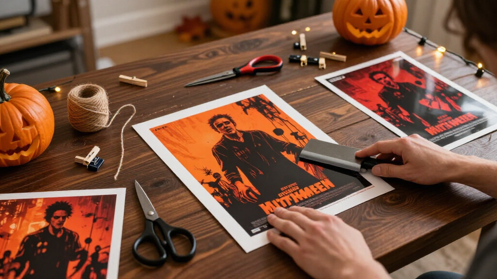

This guide shows you how to create Halloween movie poster prints from start to finish: choosing a concept, building the poster in a free design tool, sizing it correctly for print, selecting the right paper, and producing finished prints you can hang for a party or seasonal decor. You can use this process for spoof posters of imaginary horror films, vintage-style tributes to real classics for personal display, or original artwork in a movie-poster format. The guide assumes no design background — every step uses free or low-cost tools and a home printer or a standard print shop. Expect the design work to take 1-2 hours your first time, plus printing and drying. By the end, you will have at least one finished poster print sized to a standard frame, with clean margins and print-ready resolution.

Get movie nights delivered free — and shop member deals
- Fast, free delivery on millions of items
- Access to Prime Big Deal Days deals on October 6–7
- Prime Video, Amazon Music and more included

Halloween (1978) Classic Horror Movie Poster 36 x 24 Inches – The Night He Came Home
- ✔ Size: 36"L x 24"W
- ✔ Material: Paper
- ✔ Finish: Glossy

XIHOO Carpenter’s Halloween (1978) Classic Horror Poster – Unframed Wall Art, 11×17 in
- ✔ Size: 17"L x 11"W
- ✔ Material: Paper
- ✔ Finish: High Gloss

Halloween Movie Poster – John Carpenter Michael Myers Retro Horror Wall Art Print 12×18
- ✔ Size: 12 x 18 inches (31 x 46 cm)
- ✔ Material: Acid-free satin finish paper
- ✔ Special Features: Fade resistant, lightweight
Difficulty: Beginner | Time: 2-4 hours (plus optional framing time)
What You’ll Need
Tools & Materials:
- A computer (laptop or desktop) — phone screens are too small for precise poster layout
- Free design software: Canva (easiest), GIMP, or Photopea.com (free, browser-based Photoshop alternative)
- A printer (inkjet preferred for rich blacks) OR access to a print shop / online print service
- Paper: matte cardstock (65-80 lb / 176-216 gsm) or glossy photo paper in your chosen poster size
- A paper trimmer or sharp scissors and a ruler
- Optional: a standard frame (11×17 inch is the most common affordable poster frame)
- Optional: source images, fonts, or clip art downloaded in advance
Knowledge:
- Basic computer skills: downloading files, uploading images, saving to PDF
- No design experience required — this guide walks through layout choices
Two things to settle before you start. Copyright: reproducing actual studio posters or movie stills and selling or distributing them is not permitted; making personal decor from your own original designs, public-domain imagery, or licensed templates is fine. Size: decide your final print size first — everything downstream (resolution, layout, frame) depends on it. If you plan to frame the poster, buy or measure the frame before designing so you match its exact dimensions.
Halloween (1978) Classic Horror Movie Poster 36 x 24 Inches – The Night He Came Home
For pure visual impact, nothing else in this lineup competes. The CINEMAFLIX 36 x 24 inch print reproduces the iconic "The Night He Came Home" promotional art at a scale that reads across a room, which is exactly what a home theater or media room wall calls for. The glossy paper finish gives the knife-wielding silhouette and jack-o’-lantern palette real punch under warm lighting.The tradeoff is material. Compared with the Poster Foundry print’s acid-free satin stock, this standard glossy paper is more vulnerable to creasing and tearing during handling and mounting, and it offers no fade-resistance claims. At this size, that fragility is compounded: a 36-inch sheet is simply harder to mount cleanly without wrinkles, so we recommend framing it rather than pinning it up.It is also a decorative reproduction rather than an officially licensed print like the XIHOO or Poster Foundry options — a distinction collectors will care about, though casual fans likely won’t notice a difference on the wall. If your goal is a statement piece for a large wall, those compromises are easy to accept.
Pros:
- Large 36 x 24 inch format delivers genuine poster-size wall presence
- Iconic original promotional artwork from the 1978 classic
- Glossy finish makes colors pop, especially under display lighting
- Fits standard poster frame sizes commonly sold for one-sheet reproductions
Cons:
- Unframed, so a large frame purchase is essentially mandatory
- Standard paper stock is prone to creasing and tearing during mounting
- Not officially licensed, which matters for serious collectors
Best for: Home theater owners and horror fans who want a large, dramatic statement piece on a big wall
Not ideal for: Collectors who want officially licensed art, or anyone planning to hang a poster unframed without protection
Bottom line: If impact is the priority, this big glossy reproduction is the most effective way to put Michael Myers on your wall.
“If impact is the priority, this big glossy reproduction is the most effective way to put Michael Myers on your wall.”
XIHOO Carpenter’s Halloween (1978) Classic Horror Poster – Unframed Wall Art, 11×17 in
The XIHOO 11×17 inch print plays a completely different role from our top pick. Where the CINEMAFLIX poster demands a large wall and a large frame, this compact format slides into a dorm room, a cubicle, or a gallery wall alongside other horror prints without dominating the space.What stands out is the build quality for the size. It is printed on thick high-gloss photo paper with premium ink, so image sharpness holds up at close viewing distance — something that matters more at 11×17, where people will stand near it. It is also one of the two officially licensed prints in this lineup, which gives it an authenticity edge over the larger CINEMAFLIX reproduction, and a satisfaction guarantee softens the risk if the print arrives damaged.The obvious drawback is scale. Anyone hoping for the dramatic presence of a 36-inch poster will find this underwhelming, and like the others it ships unframed — though 11×17 frames are among the cheapest and easiest to find, which keeps total cost low. For first-time buyers and gift-givers, that combination of licensing, quality, and modest framing cost is hard to beat.
Pros:
- Officially licensed print with sharp, premium-ink image quality
- Thick high-gloss photo paper resists casual handling better than standard poster stock
- Compact 11×17 size fits inexpensive, widely available frames
- Satisfaction guarantee provides recourse if it arrives damaged
Cons:
- Small format lacks the wall presence of larger prints
- Indoor use only, with no fade-resistance claims
- Ships unframed like the rest of the lineup
Best for: Students, office decorators, and gift-givers who want an affordable licensed print for a small space
Not ideal for: Buyers who want a large statement piece or museum-grade archival paper
Bottom line: The most sensible low-commitment entry point into Halloween poster collecting, backed by licensing and a guarantee.
“The most sensible low-commitment entry point into Halloween poster collecting, backed by licensing and a guarantee.”
Halloween Movie Poster – John Carpenter Michael Myers Retro Horror Wall Art Print 12×18
The Poster Foundry 12×18 print is the option we would point long-term collectors toward, and the reason comes down to paper. Printed on premium acid-free satin paper, it is the only print in this lineup engineered specifically to resist fading — a meaningful difference if the poster will hang in a sunlit living room or stay framed for a decade.The low-glare satin finish also solves a problem the other two create. Both glossy prints reflect overhead lights and windows; this one stays viewable from angles where the CINEMAFLIX and XIHOO posters turn into mirrors. You give up a little of the glossy pop, but for framed display behind glass — where glare compounds — satin is the smarter finish.Its weaknesses are relative. At 12×18 it splits the size difference between the other two, making it neither a true statement piece nor an ultra-cheap accent, and the thin poster stock bends easily if handled outside a frame. But with official licensing, USA printing, and standard 12×18 frame compatibility, it is the most balanced pick for buyers who care about how the print looks in year five, not just on day one.
Pros:
- Acid-free paper with fade-resistant construction for long-term display
- Low-glare satin finish stays viewable under glass and bright lighting
- Officially licensed and printed in the USA
- Fits standard 12×18 frames available everywhere
Cons:
- Thin poster paper is less durable without lamination or framing
- Mid-size format offers less drama than the 36×24 option
- Satin finish sacrifices some of the vibrancy of glossy prints
Best for: Collectors and framed-display buyers who want fade-resistant, glare-free artwork for the long haul
Not ideal for: Anyone seeking maximum wall impact or planning to hang the print unprotected
Bottom line: The best-built print of the three, ideal when longevity and framed presentation matter more than sheer size.
“The best-built print of the three, ideal when longevity and framed presentation matter more than sheer size.”
As an Amazon Associate we earn from qualifying purchases.
Before You Start
Decide your poster concept and size now, because they shape every later step. Popular concepts include: a fake retro horror film starring your family or pets, a ‘double feature’ poster listing two imaginary movies, a vintage carnival ‘house of horrors’ style poster, or a minimalist typographic poster with a spooky title and one strong image. For size, 11×17 inches is the best beginner choice: frames are cheap and widely available, and most home printers cannot print larger without a print shop. 8.5×11 works if you only have a standard printer. Also check your printer’s maximum paper size and its capabilities before committing to a layout, and confirm you have enough ink — posters use far more black ink than typical documents, and running out mid-print ruins the sheet.
Step-by-Step Instructions
Step 1: Collect your design ingredients
Gather every image, font, and text element you plan to use into one folder on your computer before opening your design tool. Search free resource sites like Unsplash, Pixabay, or Pexels for Halloween imagery (search terms: ‘foggy forest night’, ‘pumpkin dark’, ‘full moon’, ‘gothic house’). Download fonts from Google Fonts — look for categories like ‘display’ or ‘serif’ and search terms like ‘horror’, ‘vintage’, or ‘western’. Name your files clearly (e.g., ‘moon-photo.jpg’, ‘title-font.txt’ with the font name inside).
Tip:Download the largest image versions available. A photo that looks fine on screen may be too low-resolution for print. Aim for images at least 2000 pixels on their long edge.
Check: Your folder contains 2-5 candidate images and 1-2 downloaded fonts, and each image file is over 1 MB in size.
Step 2: Set up your document at print size
Open Canva (search ‘movie poster’ for a sized template) or create a new document in your chosen tool. Set the canvas dimensions to your final print size in inches — for example, 11 x 17 inches — not pixels. Set the resolution to 300 DPI (dots per inch) if the software asks; in Canva this is handled automatically, but in GIMP or Photopea you must enter it in the new-document dialog. Set the color mode to RGB for home inkjet printing, or CMYK if you are sending the file to a professional print shop.
Tip:Never design small and plan to enlarge later. Upscaling a 8.5×11 layout to 11×17 makes text and images soft and blurry. Always design at the final size.
Check: Your blank canvas shows the correct inch dimensions in the document title or image menu, and the resolution reads 300 DPI.
Step 3: Build the background layer
Place your main background image on the canvas first, stretching it edge to edge. In Canva, drag the image into the workspace and use the corner handles to fill the frame; in GIMP, open the image as a layer and use Scale Layer. Darken the image so text will be readable: add a dark overlay (a black rectangle set to 40-60% opacity) or reduce the image brightness. Movie posters read as dark, moody documents — when in doubt, go darker.
Check: No white canvas edges show anywhere around your background image, and the overall impression is dark enough that white text would be easy to read.
Step 4: Add the title in a strong display font
Create a text box across the upper or center third of the poster and type your movie title in your display font. Make the title large — it should span at least 60% of the poster’s width. Set it in white, off-white, or a warm blood-red. Add a second smaller line beneath it for a tagline (e.g., ‘This Halloween, no one gets out alive’). Adjust letter spacing wider than default; spread-out letters read as cinematic.
Tip:Stick to a maximum of two fonts total: one display font for the title, one simple font for credits and details. More fonts make the poster look amateurish.
Check: The title is readable from across the room — stand 6-10 feet from your monitor and check. If you cannot read it instantly, increase the size or contrast.
Step 5: Add supporting elements and credit block
Fill the lower fifth of the poster with a ‘credit block’ — the small, condensed text real posters use. Type the names of your ‘cast’ (family members, pets, friends) and invented credits like ‘Directed By’ lines in a small simple font, sized around 8-10 point at print scale. Above or below the title, add a release line such as ‘COMING THIS HALLOWEEN’ or ‘OCTOBER 31 — ONE NIGHT ONLY’. If your concept needs it, add one focal image (a jack-o’-lantern, a silhouette figure) between the title and credits.
Check: The poster has a clear hierarchy: large title, medium tagline, small credit block, and empty space is intentionally placed rather than accidental.
Step 6: Export a print-ready PDF
Export or download your design as a PDF (in Canva: Share, Download, PDF Print; in GIMP: File, Export As, .pdf). Check ‘flatten’ or embed fonts if the option appears. Name the file with your poster name and size, such as ‘haunted-house-11×17.pdf’. Do not export as JPG or PNG for final printing — PDFs preserve sharp text edges.
Tip:Before exporting, zoom to 100% and inspect the title and credit text for pixelation or cut-off edges. Fix issues now; they only get worse in print.
Check: The exported PDF opens correctly, shows all fonts and images, and its stated page size matches your intended print size.
Step 7: Print a test copy at small scale
Print one test on plain office paper first. In your print dialog, choose ‘Fit to page’ on letter paper, select the highest quality print setting, and set paper type to match what is loaded. Examine the test for contrast, text legibility, and color balance. Dark backgrounds often print darker than they appear on screen, and deep blacks can look washed out if your ink is low.
Tip:This test costs one sheet of cheap paper and five minutes. Skipping it is the most common way people waste expensive cardstock.
Check: All text is legible, colors look right, and nothing is cut off at the edges of the test print.
Step 8: Print the final posters
Load your cardstock or photo paper, adjusting your printer’s paper guides so the sheet sits snug. In the print dialog, set paper size to match your sheet exactly, choose the correct paper type (matte cardstock or glossy photo), and select the highest quality setting. Print one poster, let it dry flat for 10-15 minutes before stacking anything on it, then print additional copies in small batches.
Check: The final print has solid, even blacks; crisp text edges; and no streaks, banding lines, or white unprinted margins on sides that should reach the edge.
Step 9: Trim, frame, and hang
If your printed image includes a thin white border from printer margins, trim it off with a ruler and trimmer for edge-to-edge art, or leave a small even white border as an intentional design choice. Wipe the glass of your frame clean, insert the poster, secure the backing, and hang with removable adhesive strips if you do not want wall damage, or nails for a permanent display.
Check: The framed poster sits flat against the glass with no wrinkles or trapped lint, and hangs level.
Common Mistakes to Avoid
- Designing at screen resolution (72 DPI) or in pixels, then printing large. — Always create the document at final print size in inches with 300 DPI set at the very beginning. You cannot add resolution back later.
- Using low-resolution images that look sharp on screen but print pixelated. — Only use images at least 2000 pixels on the long edge, and zoom to 100% in your design tool to check before exporting.
- Text placed too close to the poster edge gets cut off by printer margins. — Keep all text at least half an inch inside the poster edge. Most home printers cannot print to the very edge of the sheet.
- Printing directly onto expensive cardstock without a test print. — Always run one plain-paper test at high quality and confirm text, color, and layout before committing to final stock.
Troubleshooting
Problem: Final print looks darker or muddier than the on-screen design.
Solution: This is normal — screens are backlit and paper is not. Return to your design, brighten the background image slightly or reduce the dark overlay by 10-15%, then run another test print. Adjust in small increments.
Problem: Horizontal streaks or banding lines across the printed poster.
Solution: Run your printer’s built-in cleaning cycle (found in printer maintenance settings), check that no ink cartridge is low, and confirm you selected the correct paper type in the print dialog. Print a nozzle check page if your printer offers one.
Problem: Cardstock jams or will not feed through the printer.
Solution: Remove jammed paper slowly in the direction of feed, then retry with a single sheet. If jams continue, use a print shop for the final copies.
Problem: Fonts look different in the exported PDF than in the design.
Solution: The font did not embed on export. In Canva this should not happen; in GIMP, flatten the image before exporting, or convert your text layers to images. Re-download the font and reinstall it if the issue persists.
What Success Looks Like
You have succeeded when you hold a physical poster that: is the correct size for its frame with no unintended white edges; displays a title readable from across a room; shows solid blacks without streaks, banding, or pixelation; and sits flat behind clean glass when hung. Do a final check in the actual lighting conditions where it will hang — a poster that reads well in daylight may need a nearby lamp to shine at night, which is exactly the effect you want for Halloween.
Next Steps
Once your first poster works, the template becomes reusable. Save the design file and swap the title, images, and cast names each year, or produce a matching set (a ‘triple feature’ of three posters hung in a row makes a strong hallway display). If you printed at home and want larger sizes or richer color, upload your PDF to an online print service and order 18×24 or 24×36 prints — your 300 DPI file is already suitable. Store framed posters flat in a closet between seasons, and keep unframed prints in a large plastic sleeve to prevent curling. If you plan to make posters for a paid event or to sell, use only fully original or properly licensed artwork and fonts with commercial-use rights.
Frequently Asked Questions
Can I legally print posters based on real horror movies?
Making a personal, single-copy print of a poster design for display in your own home is generally low-risk, but selling, distributing, or publicly displaying copies of copyrighted posters, stills, or logos is not permitted. The safest route — and often the more fun one — is creating original spoof or tribute posters with your own imagery, titles, and cast names.
What is the best poster size for a beginner?
11×17 inches. Frames are inexpensive and available at most craft and big-box stores, many home printers can handle it if they accept tabloid paper, and print shops charge relatively little for it. Move to 18×24 or 24×36 through a print service once your design is proven at 11×17.
Glossy or matte paper — which looks better for Halloween posters?
Matte cardstock usually suits Halloween better. It reduces glare under party lighting, gives deep velvety blacks, and looks more like a vintage theatrical poster. Glossy photo paper produces punchier colors and works well for bright, stylized designs, but reflections can obscure the artwork at night.
My printer only handles 8.5×11 paper. Can I still make a real poster?
Yes. Either design at 8.5×11 and frame it in a matted 11×14 frame for a bigger wall presence, or export your print-ready PDF and send it to a print shop or online service for larger output. Designing at 300 DPI means your file scales up cleanly for professional printing.
How far in advance of Halloween should I start?
Allow one weekend. Design and test-print in a single 2-4 hour session, then print finals the same day if the test looks good. If you are ordering from a print shop or online service, start two to three weeks before Halloween to account for production and shipping time.
Fall Picks
fall essentials
As an affiliate, we earn on qualifying purchases.